Hi there! I'm Elizabeth, a Product Design Leader based in NYC.
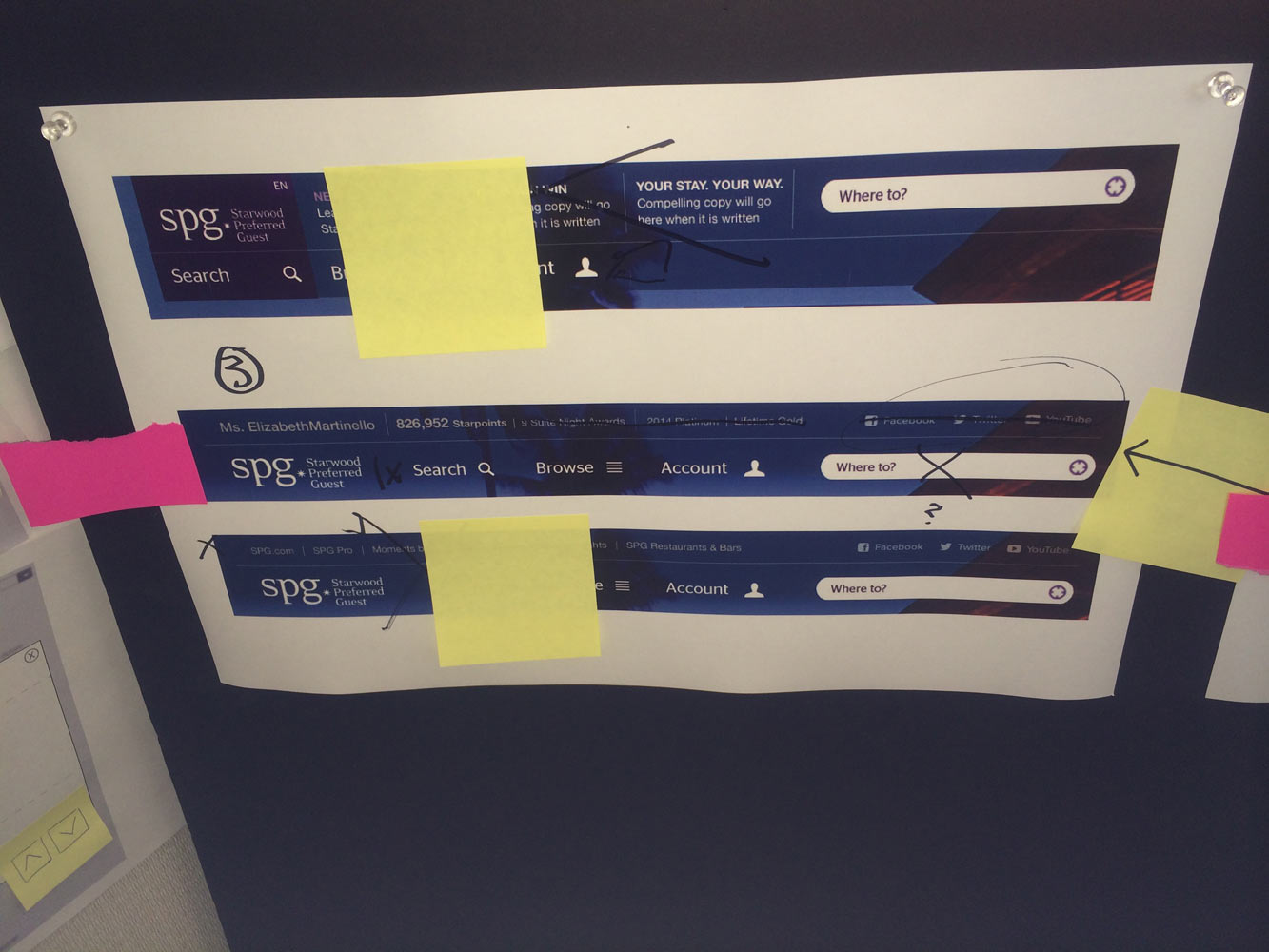
SPG HOMEPAGE: NEW & OLD


METHODOLOGY
I worked with a cross-functional UX team in Agile Kanban to deliver key portions of the site including the navigation, footer, account, and about sections. As a designer my role was to work closely and collaboratively with the Information Architects, Development, and Copywriters under tight deadlines. My responsibilities including sketching, visual UI design, prototyping, and giving creative QA feedback to both internal and external teams to ensure that the interaction, UI, and user flow were to spec and matched the creative vision.


MOBILE FIRST DESIGN
SPG under went a redesign of its mobile websites the previous year, and these templates served as a basis for the structure and thinking of the desktop experience. This meant bigger buttons and type, “chunked” streamlined content, and similar navigation structure.
ABOUT SECTIONS
The previous content sections of the desktop website were built as standalone tours in Adobe Flash, which became a huge issue when the site also needed to serve the iPad/tablet devices as well, and thus didn't function properly. These areas of the site were sunsetted in favor of a mobile first design that featured new imagery, content, video, and tools specifically personalized for different user types.


NAVIGATION
The old site had extremely minimal navigation with very vague labels that gave little insight into what they contained; navigation labeled as "Quick Links" and "Learn" contained all of the main pages of the site. This also meant that a user had to first make a selection, and then click through a series of pages with sub navigation to find the information they wanted. This wasn't particularly intuitive as the taxonomy wasn't consistent nor did the visual design hold navigation in the same place that the user's eye was already looking, leading to a disjointed experience.

Old homepage navigation included only "Quick Links" and "Learn" as menu items.
Old sub navigation included a long list of links on internal pages, without appropriate amount of spacing for tablet
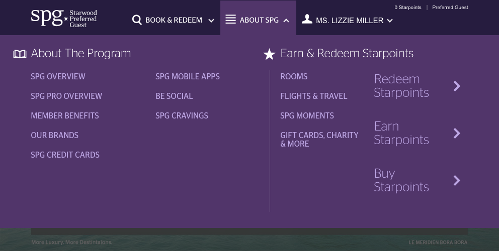
NEW NAVIGATION
The old system was replaced by a three bucket structure, similar to mobile web, with navigation content customized to the user upon login. The links were large enough for fat fingers on tablet, with much more intuitively labeled navigation exposed.


OPTIMIZED SIGN IN PROCESS
The old sign in page used space poorly, was loaded with extra links and tool tips, and hid functionality
Even the account access portion of the site needed to be readdressed after sub navigation was stripped from pages. The old page was filled with legacy error messaging and inconsistencies, resulting in an increased volume of calls to the Customer Care Center from guests who didn't understand the difference between not having an account, and having an account but needing to create a digital login for it.
An extensive messaging and interaction redesign was envisioned by my team, simplifying errors, making everything tappable, and streamlining clutter. The resulting template was rolled out across all 10 of Starwood's brands, creating a much more cohesive experience across all of Starwood's sites, with the goal of reducing costs, calls and complaints to the Customer Care Center.
NEW SIGN IN PAGE
RESULTS
Eventually, nearly every single page of the 300+ page site was updated by myself and the development team, at least slightly, with the tablet experience in mind. This resulted in a steep reduction in abandonment on tablet as well as reducing errors throughout the booking process. The new website and tools received much buzz and praise by a number of industry press and travel blog sites.
In April 2016, Marriott and Starwood shareholders approved a deal that would combine the two companies, selling Starwood for $14.41 billion, resulting in the largest hotel company in the world with 5,500 properties and 1.1 million rooms around the world. Visit spg.com