Hi there! I'm Elizabeth, a Product Design Leader based in NYC.
THE BRAND
The final Branding, Naming, & Color Scheme was borne out of research and the desire to cater to the busy, career-centric yet tech saavy consumer. The restrained palette and stark typography is meant to reflect a minimal, elegant, and high-end feel.

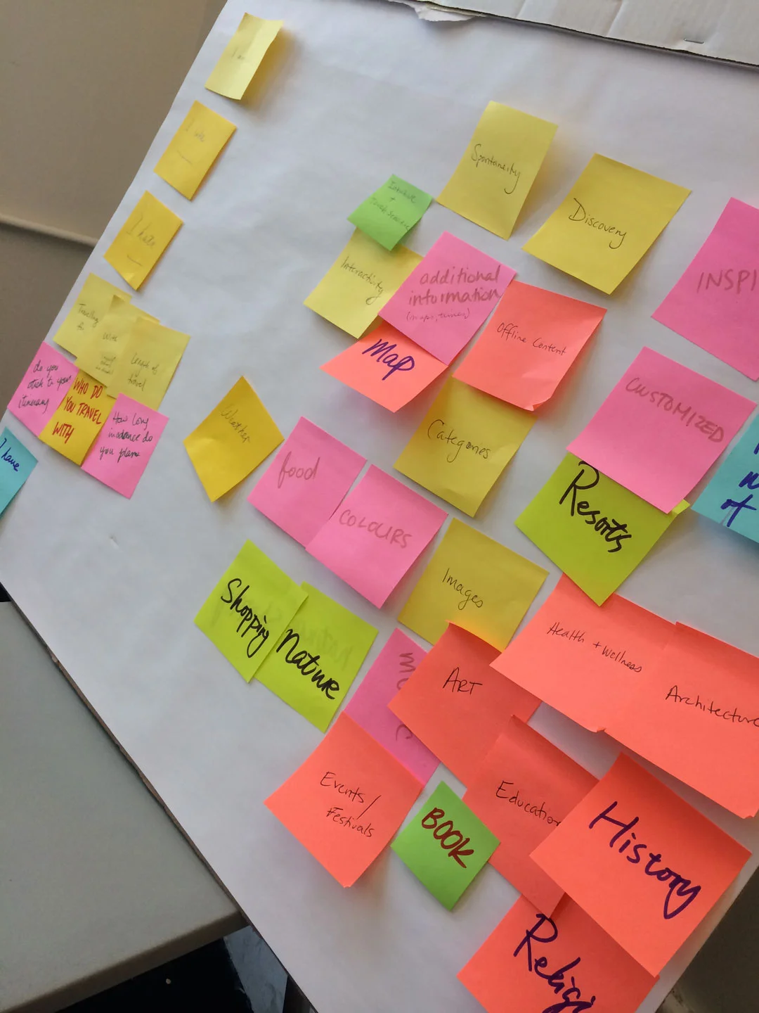
INITIAL RESEARCH
Our team was tasked with creating a mobile travel app that answered some of the common pain points for users. We spent a day on initial research and interviews and the next three days on testing our ideas, assumptions, and prototypes.
What we found is that many people travel with less than two weeks notice, often by themselves, and are looking for exploration. For those with busy schedules, copious amounts of time for research in finding the best restaurants and activities that arn't touristy often comes down to the last 48 hours, at which point it becomes easy to feel overwhelmed by the amount of choices.
People's decisions in where to travel and what to do is personal and disparate across different populations, but the desire for spontaneity and adventure is a common theme for those looking for an escape, whether that mean lying on a tropical beach, skiing the best fresh powder, or exploring a historical place.
PERSONAS + SCENERIO + KEY USE CASE
“Time is precious, waste it wisely.”
Scenario: Rachel wants to take a vacation but she doesn’t know where she wants to go. She is so busy with work and wants to escape the cold weather but she doesn’t have time to plan.
Her Goal: She has a 3-day weekend ahead and wants to escape the NYC winter weather and relax somewhere tropical, she doesn't care where exactly.
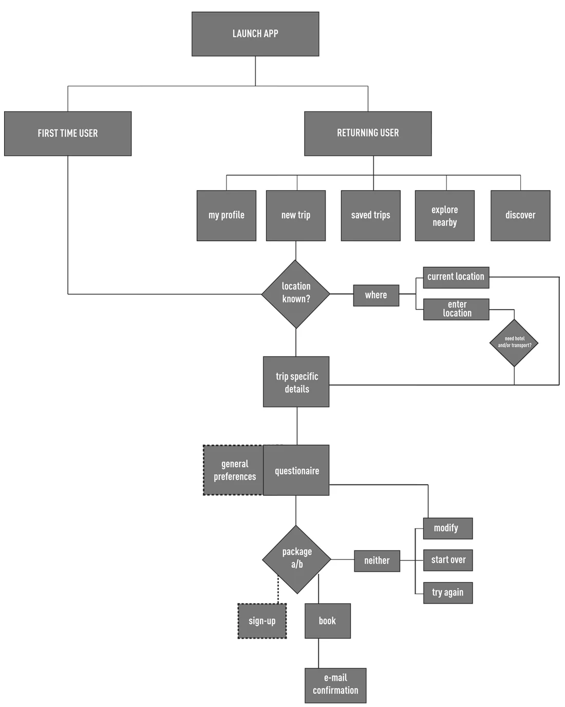
She pulls out her phone 1) opens the app, and tries to figure out where to go. The app then 2) asks her dates of travel and intended budget. After that, she 3) is directed to a set of questions regarding Climate, Activities, Food, and Hotel preferences. From there the app generate 2 complete package she can choose from or she can cancel for new options. She 4) is presented with two packages. Rachel likes the fact that the options are straightforward, clearly presented and catered to her interests with unknown surprises along the way and she decides to make her travel selection. Within moments, Rachel is 5) able to create a profile to book and confirm this package, and gets an email confirmation. After sailing through the airport security and arriving to the hotel, she 6) is given push alerts throughout the trip for booked.
INITIAL SKETCHES + PROCESS


FINAL USER FLOW
FINAL WIREFRAMES


Final UI Design
The final UI delivers on its promise of luxury, speed and conveinence for our customer type with a visually appealing interface that skews towards fashion with minimal type and straightforward content.


